1
2
3
**create a fresh folder
run the commands npm create vite@latest (in the folder directory)
also cd to the directory and run the command npm install**
1
2
3
4
5
6
7
8
9
10
11
12
13
14
15
16
17
18
19
20
21
22
23
24
25
26
27
28
step 1
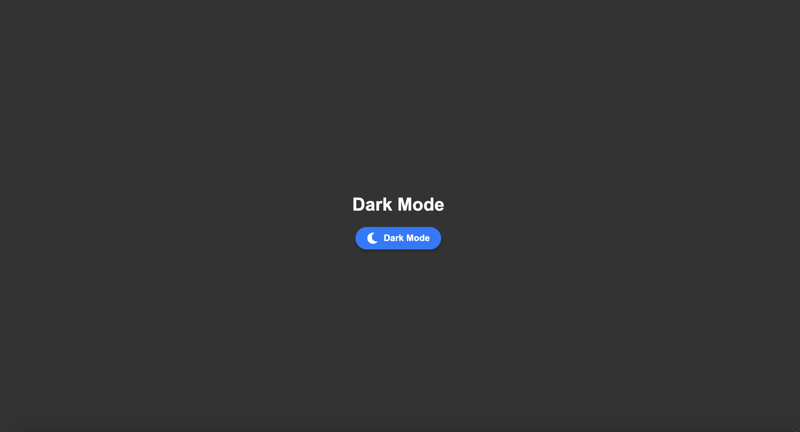
`code in app.jsx`
import react, { usestate } from react;
import { fasun, famoon } from react-icons/fa; // import sun and moon icons
import ./app.css;
function app() {
const [darkmode, setdarkmode] = usestate(false);
// toggle dark mode
const toggletheme = () => {
setdarkmode(!darkmode);
};
return (
<div classname={darkmode ? dark : light}>
<div classname="container">
<h1>{darkmode ? dark mode : light mode}</h1>
<button classname="toggle-button" onclick={toggletheme}>
{darkmode ? <famoon classname="icon" /> : <fasun classname="icon" />}
{darkmode ? dark mode : light mode}
</button>
</div>
</div>
);
}
export default app;
1
2
3
4
5
6
7
8
9
10
11
12
13
14
15
16
17
18
19
20
21
22
23
24
25
26
27
28
29
30
31
32
33
34
35
36
37
38
39
40
41
42
43
44
45
46
47
48
49
50
51
52
Code in App.css
`body {
margin: 0;
font-family: Arial, sans-serif;
}
.container {
text-align: center;
height: 100vh;
display: flex;
flex-direction: column;
justify-content: center;
align-items: center;
}
/* Light Mode Styles */
.light {
background-color: #f9f9f9;
color: #333;
}
/* Dark Mode Styles */
.dark {
background-color: #333;
color: #f9f9f9;
}
/* Toggle Button Styles */
.toggle-button {
display: flex;
align-items: center;
gap: 10px;
padding: 10px 20px;
border: none;
border-radius: 30px;
cursor: pointer;
font-size: 16px;
font-weight: bold;
background-color: #007bff;
color: white;
box-shadow: 0 4px 6px rgba(0, 0, 0, 0.2);
transition: all 0.3s ease;
}
.toggle-button:hover {
background-color: #0056b3;
transform: scale(1.05);
}
.icon {
font-size: 20px;
}`
以上就是React 中的深色模式 (vite)的详细内容,更多请关注php中文网其它相关文章!