这是前端挑战赛 - 12 月版的提交,glam up my markup:冬至
注: 在这个项目的开发过程中,我注意到冬至的主题也启发了其他挑战者。这突显了这个季节的自然和魔力是多么鼓舞人心。我的灵感来自于我个人对冬天的憧憬,注重细节并诠释它的魅力。我希望这个项目能够为这一挑战中的想法多样性做出贡献。
我建造了什么
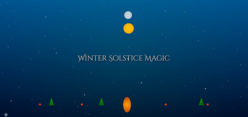
“冬至魔法”是一个交互式网络场景,旨在捕捉冬至的本质和魅力。该项目具有太阳、月亮、星星、北极光、飘落的雪花等动画元素,以及其他节日元素,如发光的火焰、闪烁的灯光和射出的彗星。目标是创造一种视觉上引人入胜的体验,让观众沉浸在冬季的魔力中,同时展示现代网络技术的力量。
演示
您可以在这里现场体验该项目:冬至魔法演示
完整的代码可以在这里:
1
2
3
4
5
6
7
8
9
10
11
12
13
14
15
16
17
18
19
20
21
22
23
24
25
26
27
28
29
30
31
32
33
34
35
36
37
38
39
40
41
42
43
44
45
46
47
48
49
50
51
52
53
54
55
56
57
58
59
60
61
62
63
64
65
66
67
68
69
70
71
72
73
74
75
76
77
78
79
80
81
82
83
84
85
86
87
88
89
90
91
92
93
94
95
96
97
98
99
100
101
102
103
104
105
106
107
108
109
110
111
112
113
114
115
116
117
118
119
120
121
122
123
124
125
126
127
128
129
130
131
132
133
134
135
136
137
138
139
140
141
142
143
144
145
146
147
148
149
150
151
152
153
154
155
156
157
158
159
160
161
162
163
164
165
166
167
168
169
170
171
172
173
174
175
176
177
178
179
180
181
182
183
184
185
186
187
188
189
190
191
192
193
194
195
196
197
198
199
200
201
202
203
204
205
206
207
208
209
210
211
212
213
214
215
216
217
218
219
220
221
222
223
224
225
226
227
228
229
230
231
232
233
234
235
236
237
238
239
240
241
242
243
244
245
246
247
248
249
250
251
252
253
254
255
256
257
258
259
260
261
262
263
264
265
266
267
268
269
270
271
272
273
274
275
276
277
278
279
280
281
282
283
284
285
286
287
288
289
290
291
292
293
294
295
296
297
298
299
300
301
302
303
304
305
306
307
308
309
310
311
312
313
314
315
316
317
318
<!DOCTYPE html>
<html lang="en">
<head>
<meta charset="UTF-8">
<meta name="viewport" content="width=device-width, initial-scale=1.0">
<title>Winter Solstice Scene</title>
<style>
body {
margin: 0;
overflow: hidden;
background: linear-gradient(to bottom, #003366, #000);
display: flex;
justify-content: center;
align-items: center;
height: 100vh;
color: white;
font-family: Arial, sans-serif;
}
.sky {
position: absolute;
top: 0;
left: 0;
width: 100%;
height: 100%;
background: linear-gradient(to top, #1e3c72, #2a5298);
z-index: -1;
animation: skyTransition 20s infinite alternate;
}
.sun {
position: absolute;
width: 80px;
height: 80px;
background: radial-gradient(circle, #ffcc00, #ff9900);
border-radius: 50%;
animation: moveSun 8s infinite;
z-index: 1;
}
.moon {
position: absolute;
width: 60px;
height: 60px;
background: radial-gradient(circle, #ffffff, #cccccc);
border-radius: 50%;
animation: moveMoon 8s infinite;
z-index: 1;
opacity: 0.8;
}
.stars {
position: absolute;
top: 0;
left: 0;
width: 100%;
height: 100%;
pointer-events: none;
z-index: 0;
}
.star {
position: absolute;
width: 3px;
height: 3px;
background: white;
border-radius: 50%;
opacity: 0;
animation: twinkle 3s infinite;
}
.aurora {
position: absolute;
top: 0;
left: 0;
width: 100%;
height: 100%;
background: radial-gradient(circle, rgba(0, 255, 150, 0.3), transparent);
opacity: 0.4;
animation: auroraEffect 10s infinite alternate;
z-index: -1;
}
.comet {
position: absolute;
width: 10px;
height: 10px;
background: radial-gradient(circle, #ffffff, transparent);
border-radius: 50%;
box-shadow: 0 0 10px 5px #ffffff;
opacity: 0.8;
animation: flyComet 6s infinite;
}
.light-string {
position: absolute;
bottom: 10%;
width: 100%;
display: flex;
justify-content: space-evenly;
}
.light {
width: 15px;
height: 15px;
background: red;
border-radius: 50%;
animation: blinkLight 2s infinite alternate;
}
.title {
position: absolute;
top: 50%;
left: 50%;
transform: translate(-50%, -50%);
font-size: 3.5rem;
font-family: Cinzel Decorative, cursive;
color: #ffddcc;
text-shadow: 3px 3px 10px #000;
opacity: 0;
animation: fadeInOut 10s infinite;
}
.fire {
position: absolute;
bottom: 5%;
left: 50%;
transform: translateX(-50%);
width: 50px;
height: 100px;
background: radial-gradient(circle, rgba(255, 165, 0, 1), rgba(255, 69, 0, 0.7));
border-radius: 50%;
animation: flicker 0.5s infinite;
}
@keyframes flicker {
0%, 100% {
transform: scale(1);
opacity: 0.8;
}
50% {
transform: scale(1.2);
opacity: 1;
}
}
.tree {
position: absolute;
bottom: 10%;
left: calc(10% + var(--position, 0%));
width: 40px;
height: 60px;
background: linear-gradient(to bottom, #228B22, #006400);
clip-path: polygon(50% 0%, 0% 100%, 100% 100%);
}
@keyframes fadeInOut {
0%, 100% {
opacity: 0;
}
50% {
opacity: 1;
}
}
@keyframes moveSun {
0% {
top: 80%;
left: 10%;
}
50% {
top: 20%;
left: 50%;
}
100% {
top: 80%;
left: 90%;
}
}
@keyframes moveMoon {
0% {
top: 20%;
left: 90%;
}
50% {
top: 10%;
left: 50%;
}
100% {
top: 20%;
left: 10%;
}
}
@keyframes skyTransition {
0% {
background: linear-gradient(to top, #1e3c72, #2a5298);
}
50% {
background: linear-gradient(to top, #000428, #004e92);
}
100% {
background: linear-gradient(to top, #2c3e50, #4ca1af);
}
}
@keyframes twinkle {
0%, 100% {
opacity: 0;
}
50% {
opacity: 1;
}
}
@keyframes auroraEffect {
0% {
transform: translateX(-20px) scale(1.2);
}
100% {
transform: translateX(20px) scale(1.5);
}
}
@keyframes flyComet {
0% {
top: -10%;
left: 110%;
}
100% {
top: 110%;
left: -10%;
}
}
@keyframes blinkLight {
0% {
background: red;
}
100% {
background: yellow;
}
}
</style>
<link href="https://fonts.googleapis.com/css2?family=Cinzel+Decorative:wght@400;700&display=swap" rel="stylesheet">
</head>
<body>
<div class="sky"></div>
<div class="aurora"></div>
<div class="sun"></div>
<div class="moon"></div>
<div class="stars"></div>
<div class="light-string">
<div class="light"></div>
<div class="light"></div>
<div class="light"></div>
<div class="light"></div>
<div class="light"></div>
</div>
<div class="title">Winter Solstice Magic</div>
<div class="fire"></div>
<div class="tree" style="--position: 10%;"></div>
<div class="tree" style="--position: 30%;"></div>
<div class="tree" style="--position: 70%;"></div>
<script>
// Add twinkling stars
const starContainer = document.querySelector(.stars);
for (let i = 0; i < 100; i++) {
const star = document.createElement(div);
star.classList.add(star);
star.style.top = `${Math.random() * 100}%`;
star.style.left = `${Math.random() * 100}%`;
star.style.animationDelay = `${Math.random() * 5}s`;
starContainer.appendChild(star);
}
// Create a comet
const createComet = () => {
const comet = document.createElement(div);
comet.classList.add(comet);
comet.style.top = `-${Math.random() * 50}px`;
comet.style.left = `${Math.random() * window.innerWidth}px`;
document.body.appendChild(comet);
setTimeout(() => comet.remove(), 6000);
};
setInterval(createComet, 8000);
// Interactive snow effect
const createSnowflake = () => {
const snowflake = document.createElement(div);
snowflake.classList.add(snowflake);
snowflake.style.position = absolute;
snowflake.style.top = `-5px`;
snowflake.style.left = `${Math.random() * window.innerWidth}px`;
snowflake.style.width = snowflake.style.height = `${Math.random() * 5 + 2}px`;
snowflake.style.background = white;
snowflake.style.borderRadius = 50%;
snowflake.style.opacity = `${Math.random() * 0.8 + 0.2}`;
snowflake.style.transition = top 3s linear;
document.body.appendChild(snowflake);
setTimeout(() => {
snowflake.style.top = `${window.innerHeight + 10}px`;
}, 50);
setTimeout(() => {
snowflake.remove();
}, 3000);
};
setInterval(createSnowflake, 150);
</script>
</body>
</html>
下面是该项目的预览图:
旅行
创作“冬至魔法”是一个令人兴奋且充满挑战的过程。以下是我的旅程概述:
想法
我想通过身临其境的网络体验将冬至的美丽和神秘带入生活。该项目的灵感来自冬季的自然元素以及这个季节宁静而充满活力的氛围。
使用的技术
基本结构的 html。 用于动画、渐变和样式的 css。 用于动态交互的 javascript,包括雪花、星星和彗星的生成。 google fonts 使用“cinzel decorative”字体增强标题文本的美感。主要特点
动态背景: 天空在渐变之间平滑过渡,以模仿一天中的不同时间。
互动元素: 星星闪烁、雪花飘落、彗星划过屏幕,为场景增添生机。
节日详情: 闪烁的灯光和炽热的火焰增强了季节的魅力。
挑战和经验教训
其中一项挑战是优化动画以确保在各种设备上的流畅性能。我学到了很多关于使用 css 和 javascript 管理动画性能的知识。我特别自豪的是多个动画元素的无缝集成,而不影响页面的响应能力。
下一步是什么
未来,我希望:
添加音频元素,例如微妙的冬季主题背景音乐或音效。
引入用户交互性,允许观看者自定义场景的各个方面。
将项目扩展为具有不同季节主题的系列。
执照
该项目的代码已获得 mit 许可证的许可,使其免费开放给任何人使用或改编。
致谢
特别感谢 dev 社区主办本次挑战并通过他们的平台提供灵感。感谢您考虑我的提交!我希望您喜欢“冬至魔法。”
以上就是魔法冬境——冬至之旅的详细内容,更多请关注php中文网其它相关文章!